Working on the iPad Pro 12.9" (2017)

I had mentioned on my Patreon page a few weeks ago that I've started using an iPad Pro at times for coloring. 

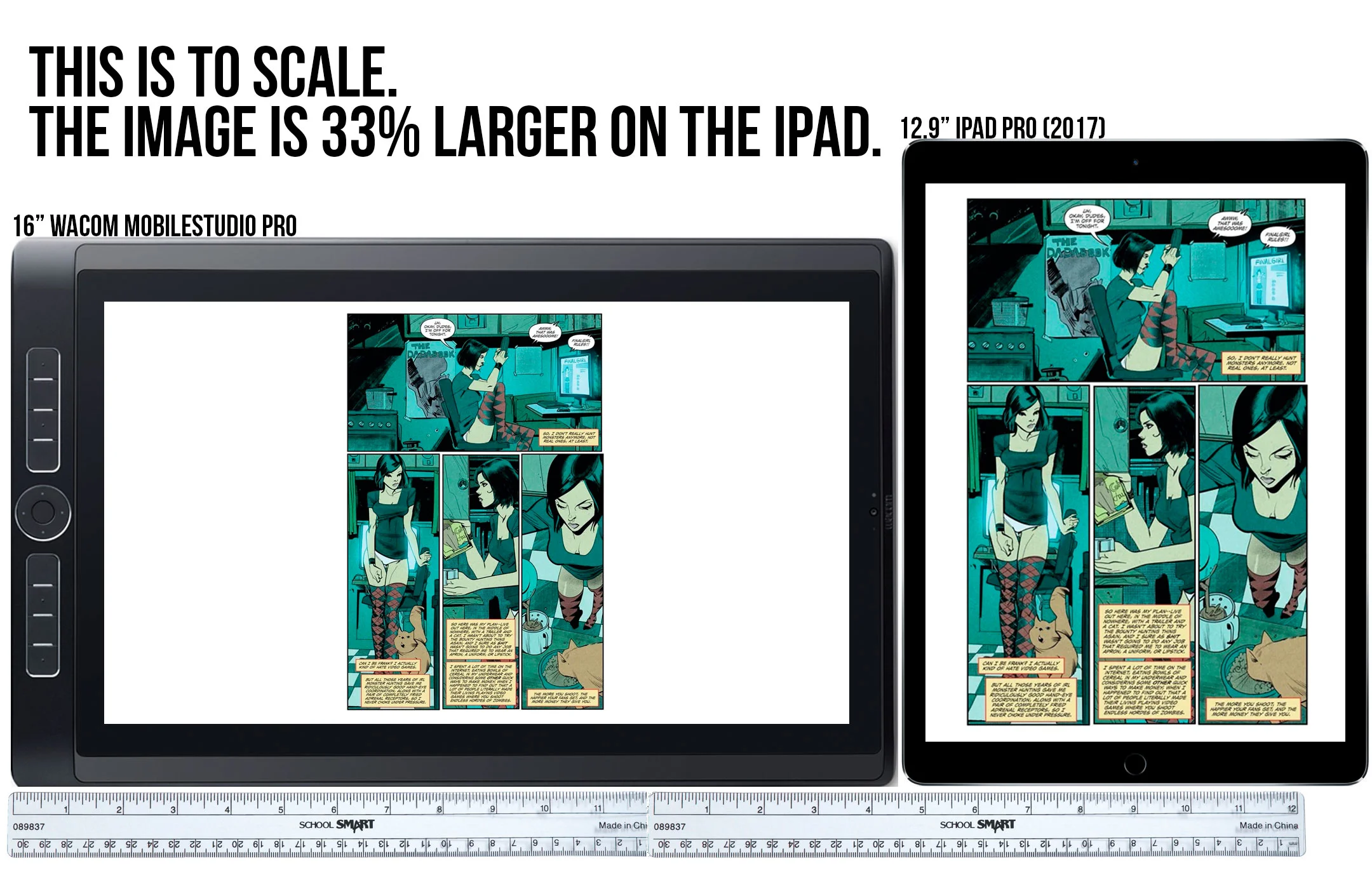
Someone asked me if I thought the screen was too small. I've got a video coming this Tuesday (October 10, 2017) with my full run down & sort of a review on the iPad Pro (2017) and why it replaced my Wacom MobileStudio Pro when I'm working away from my main desktop. This image is part of the video, but I thought I'd share it here.

iPad Pro 12.9" (2017) vs Wacom MobileStudio Pro 16"

The iPad Pro is light enough to used in portrait or landscape mode, and when you turn it vertically, the comic page on the screen is actually about a third larger than the 16" MBP in landscape. Now you CAN turn the Wacom vertically, but I don't believe it's really designed to work that way, plus trying to hold a nearly five pound (2.25kg roughly) device vertically just isn't comfortable. Hopefully this explains why it isn't too small. :)

Evercon promo poster

Here's a promo poster I colored for Tim Seeley and his hometown con - Evercon. The narrated time-lapse is below as well. :)

In this video, I'm coloring a promotional poster for EVERCON! Line art by Tim Seeley. ► My Coloring Course (Try two lessons for free!) http://learn.comiccolor.com/courses/coloring-comics-dl?coupon=youtuber If you'll looking to learn more, check out my complete Photoshop digital coloring course--50+ real-time video tutorials--10 hours of lessons (with downloadable presets for my brushes, tools, actions, and color swatches).

A Very Different Coloring Method (than mine anyway)

Colorist Tamra Bonvillain is a friend of mine, and she has a VERY different method of coloring than I do. I thought it was pretty interesting, so I thought I'd do a video to explain the basic concepts anyway. 

Tamra paints on masked "Solid Color" adjustment layers with a different layer for each color. She also does some things grouping layers and combining them with Levels adjustments layers that I do get into yet. I'm still figuring it out too. 

This method does have some advantages, and I learned a lot trying to figure it out! I won't be changing to this method or or anything, but I do think I'll be using parts of this method for certain things. It's always good to learn new tricks.

Anyway, enjoy the video!

Coloring contest!

Hey! To celebrate 12,000 YouTube subscribers, I’m doing a coloring contest! The winner will be enrolled in my coloring course and receive a full portfolio review. Second place also gets enrolled. Third place… steak knives… just kidding, there’s no steak knives and no third place.

If you aren’t familiar with my course, you can read about it here: http://learn.comiccolor.com/courses/coloring-comics-dl

It’s very thorough--10 hours of tutorials, and it includes all of my Photoshop presets, settings, brushes, etc. It also has a syllabus, so you know it’s legit!

I don’t want you working too long on this, so it’s just one panel for fun. You can download the image here (kindly donated by pro penciller and colleague Max Dunbar (LEGENDS OF BALDUR’S GATE, RED SONJA, SLASH & BURN): https://www.dropbox.com/…/ColoringComics-coloring_contest_M… Click the three dots on the top right to download it.

I’ll be looking for clarity and focus more than fancy lights and shadows. Storytelling is what coloring comics is all about. Highlight what’s important; minimize what isn’t. No script here, so just assume the girl coming through the door is the focus of the panel. Hair/skin colors don’t matter. I won’t judge on things like that.

Post your entry by uploading a link to the image in a comment on this post. Do not email them. (I’ll also be seeing if you can follow instructions!) :)

The contest ends on June 20, and I’ll decide a winner shortly after that. Best of luck!

Source: https://www.facebook.com/kmichaelrussell/posts/1196463170372277

New video and new (vague) project news!

Hey people! I uploaded a new video tonight. This is a time-lapse recording of a page from TRANSFERENCE #4 for Black Mask Studios. I'm filling in for my friend and fellow colorist, Tamra Bonvillain

The artist in this issue is Toni Fejzula (VEIL). The writer is my former HACK/SLASH collaborator, Michael Moreci (HOAX HUNTERS, CURSE, ROCHE LIMIT). 

If you are wondering what I'm doing with Photoshop in the video around 1:15, I'm using a gradient map. I made a video about them once here. I use them to shift the colors around in interesting ways on an adjustment layer, then set the layer mode to COLOR, then adjust the opacity. I then use that as a base to start adjusting my base colors. 

Anyway, this project sort of fell in my lap suddenly, but I do have three new projects coming in 2016 that I can't say anything about yet, but one will be at Image, and the other two, IDW. All are creator-owned projects, and I'm very excited about them! I expect they'll start getting announced sometime in January 2016. UGH. :) 

Talk soon!


A flatting tutorial!

By popular request, a flatting tutorial video!  Flatters, sometimes called coloring assistants, break up all of the elements on the page into separate colors. It's sometimes called color separations. The colors themselves are irrelevant, but they make the colorist's job easier by allowing them to just select the areas with a magic wand, as opposed to re-lassoing everything when coloring.

There are many, many wrong ways for a flatter to flat pages. I'm constantly hearing from fellow colorists that have a hard time finding new flatters that know how to do it properly.

So I made this video to try to rectify that! I'm sure there's more than one correct way to do it, but this is my way, and I know it works! 

Wacom posted my video on their Tumblr!

Wacom posted my "Which Tablet Should I Buy?" video on their Tumblr! Pretty cool! Check it out below: 

http://wacom.tumblr.com/post/127646889579/a-testament-to-legacy-hardware-and-new-hardware